GreenPaths Software
Empowering and optimizing field sales teams in the cannabis industry.
SnapPea Design ✦ 2023 - 2024

1.0 - Mobile for sales reps
Video loop
Overview
The GreenPaths app allows salespeople to make well-informed sales decisions and valuable customer relations by providing on-the-go access to customer data and tools. When I joined this project, most of the product strategy, low-fidelity screens, and feature specifications were complete; my process focused on high-fidelity designs and preparing the app for shipment with a fresh new look.
This case study only covers the Sales Rep mobile app which was designed shortly after the Manager's web app - mainly dashboards. If you want to learn more about the desktop platform, shoot a message.
My Role
As the junior UX designer for this contract, I was responsible for the design system, user interface, user experience, and development hand-off for all V1 features of the product.
Timeframe
4 months, Nov 2023 - Feb 2024 ❁ Currently Live!
Thanks to
GreenPaths
Jordan Brooks
Jamie-Lee Tipping
SnapPea Design
Victoria Vanten
Development
Silas Gomes
Isadora Barros
So SnapPea, how might we improve the UX and branding of GreenPath’s mobile Sales Representative app?
We strived to achieve three things...
🧭
Supportive not disruptive.
Seek ways for the app to conform to a user’s behaviour pattern instead of trying to changing it.
💪
Strong visual identity.
Use effective styling with the new brand to increase trust and cohesion across the two platforms.
⌚️
Timely, actionable, relevant.
In a mountain of data, prioritize the types that will may require actions from the user, often.
Constraints
🕴🏻
Avoid being bureaucratic
Sales reps are usually resistance to sales apps because they want to feel empowered, not watched.
💻
Limited to Material 3 design
every thing we made had to be doable with Material design - so no graphs.
Context
Highlights
Imagine you’re a sales person ...


Dashboard
Start viewing your progress and possible next steps on one page.
Worked on home page UI design and information architecture.
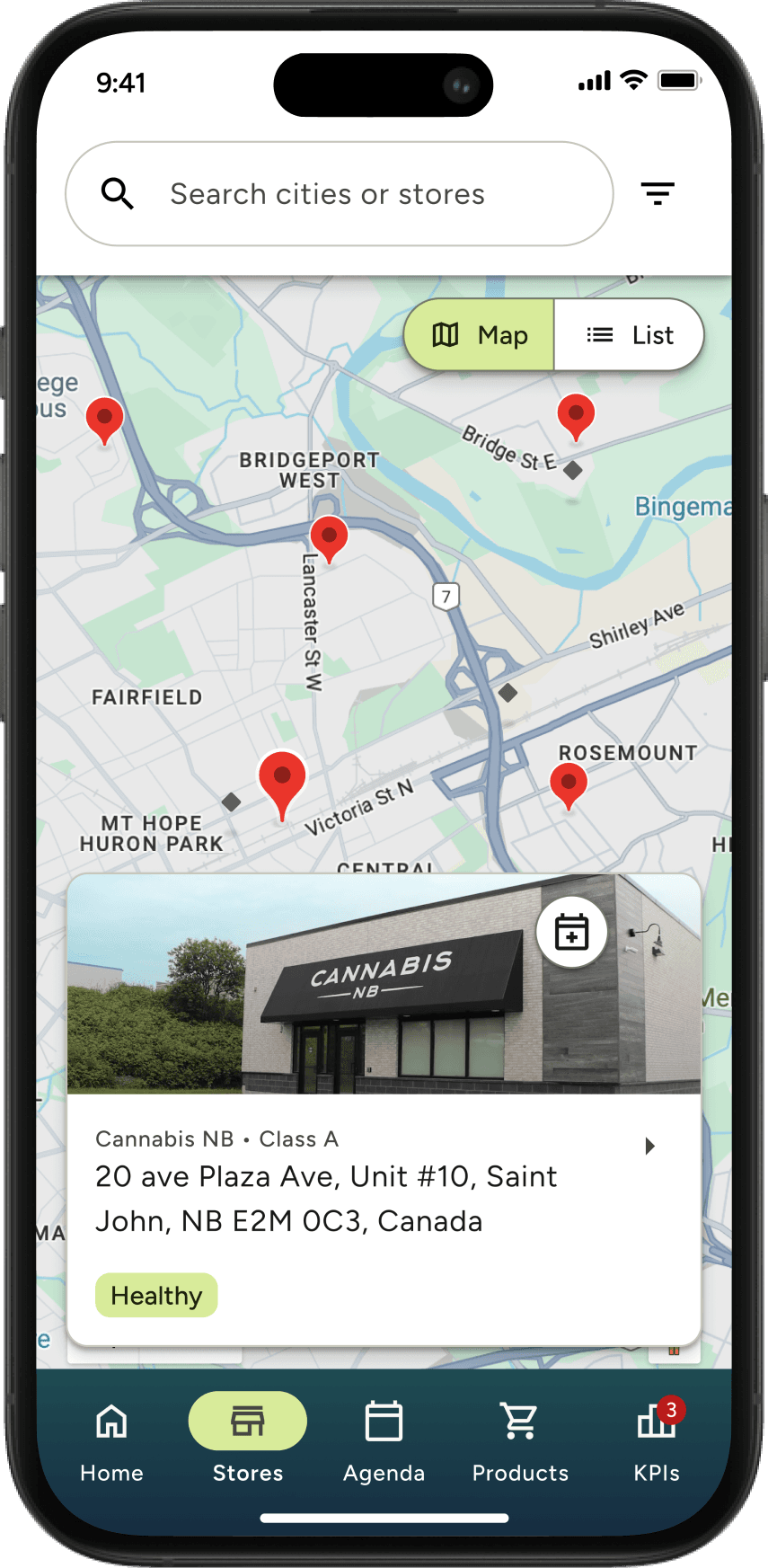
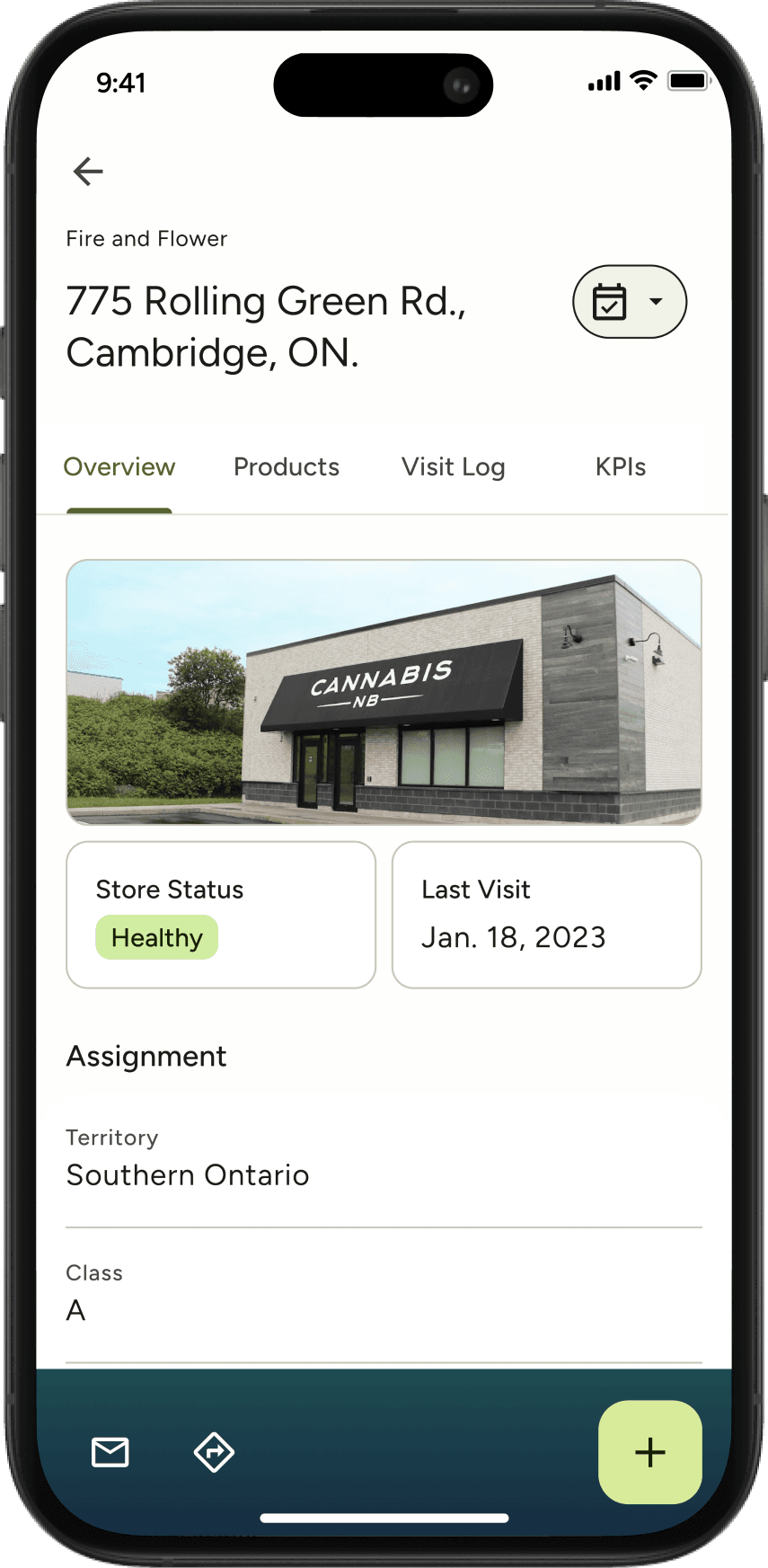
Stores
Swap between a map or a list, find all the stores you’ve visited and possible next stops!
I built various states of the card components and design the map/list view swapping experience.
I also made the custom location pins!

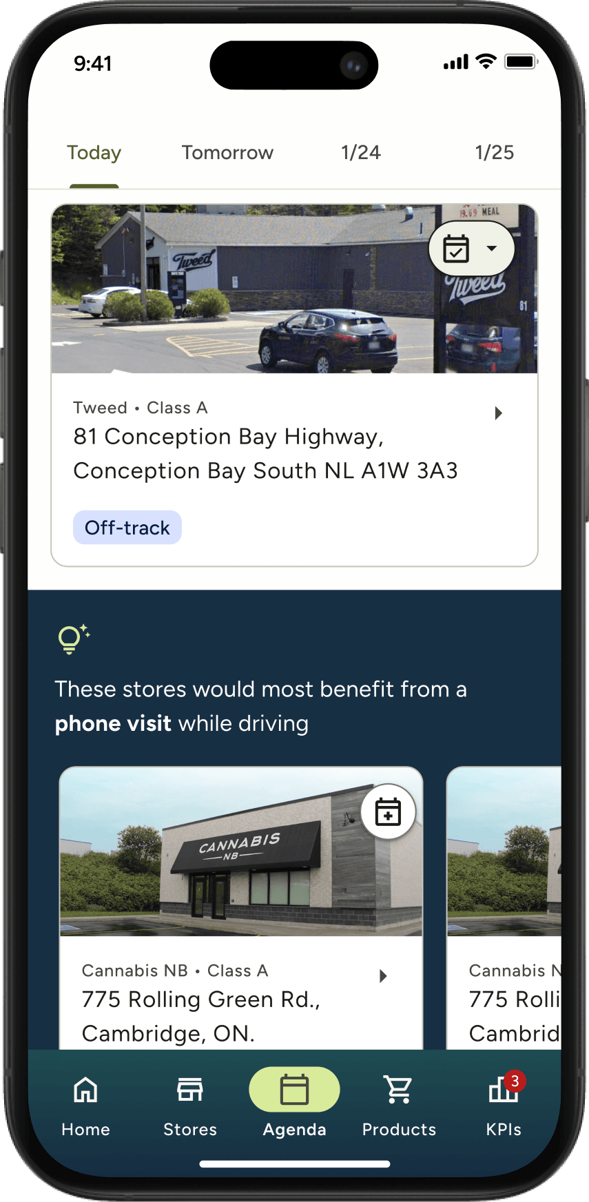
Agenda
Create a schedule and read a store’s details page to build a well-informed and personalized sales pitch.
Limited to the M3 design components, I defined the IA of the Agenda and Store details page with a focus on convenience and accessibility.
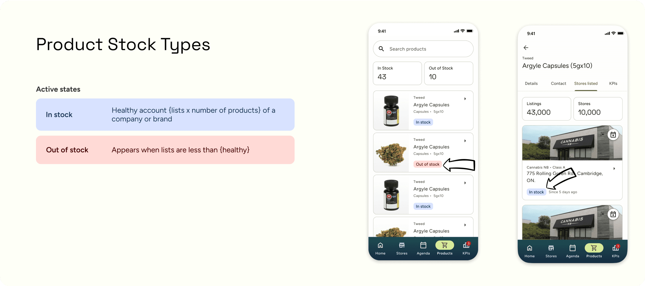
Product Knowledge
🍃 Learn about any product to enhance your on-the-go sales pitches by searching and filtering in the Products tab.
✦ Focused on information architecture, searching experience, and navigation.


Performance tracking
✍🏼 Keep note of your conversation with one quick form—8 minutes tops! Then, track your key performance progress in the KPIs tab.
✦ I worked with the design lead, developers and client to create the ultimate form for users, and then summarized all the data in a card component.
Visual Design System
Building card components.
Sales people need information, fast. If anything felt like a huge learning curve, users would be less diligent in tracking and entering sales data, which was vital to the other platform solutions.
So when it I was creating the components, I researched accessibility, other sales app, and asked the team questions about sales people to create these concise and scalable designs.
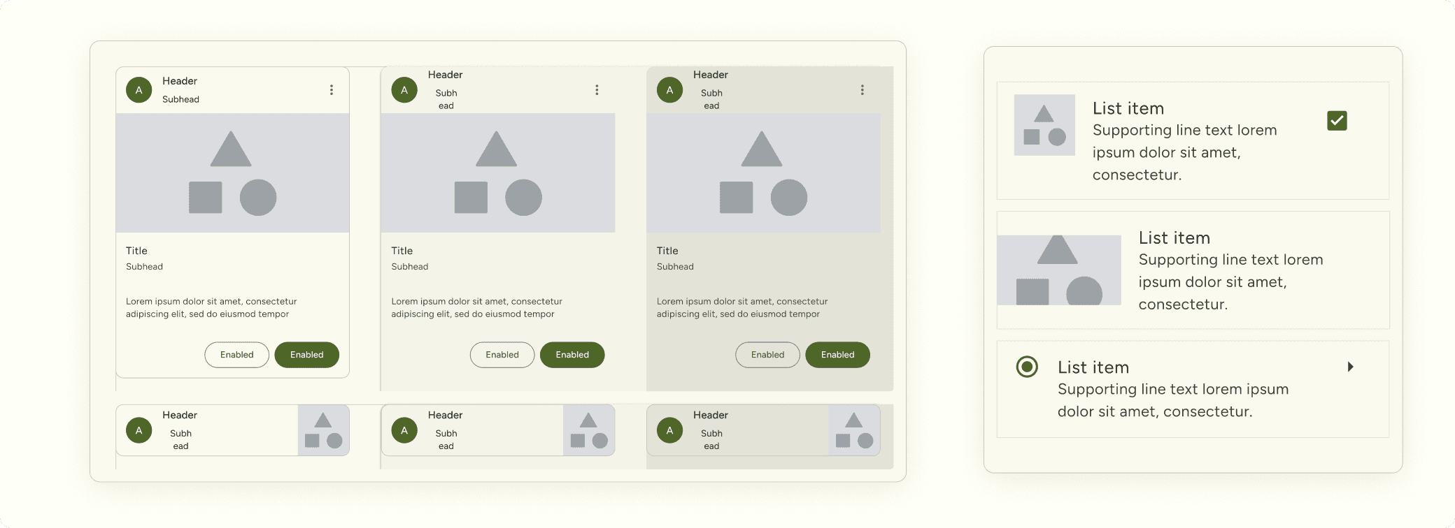
2.0 How it started, M3 building blocks
Image


Visual Language
Revamping the system
Creating cohesion between two powerful platforms.
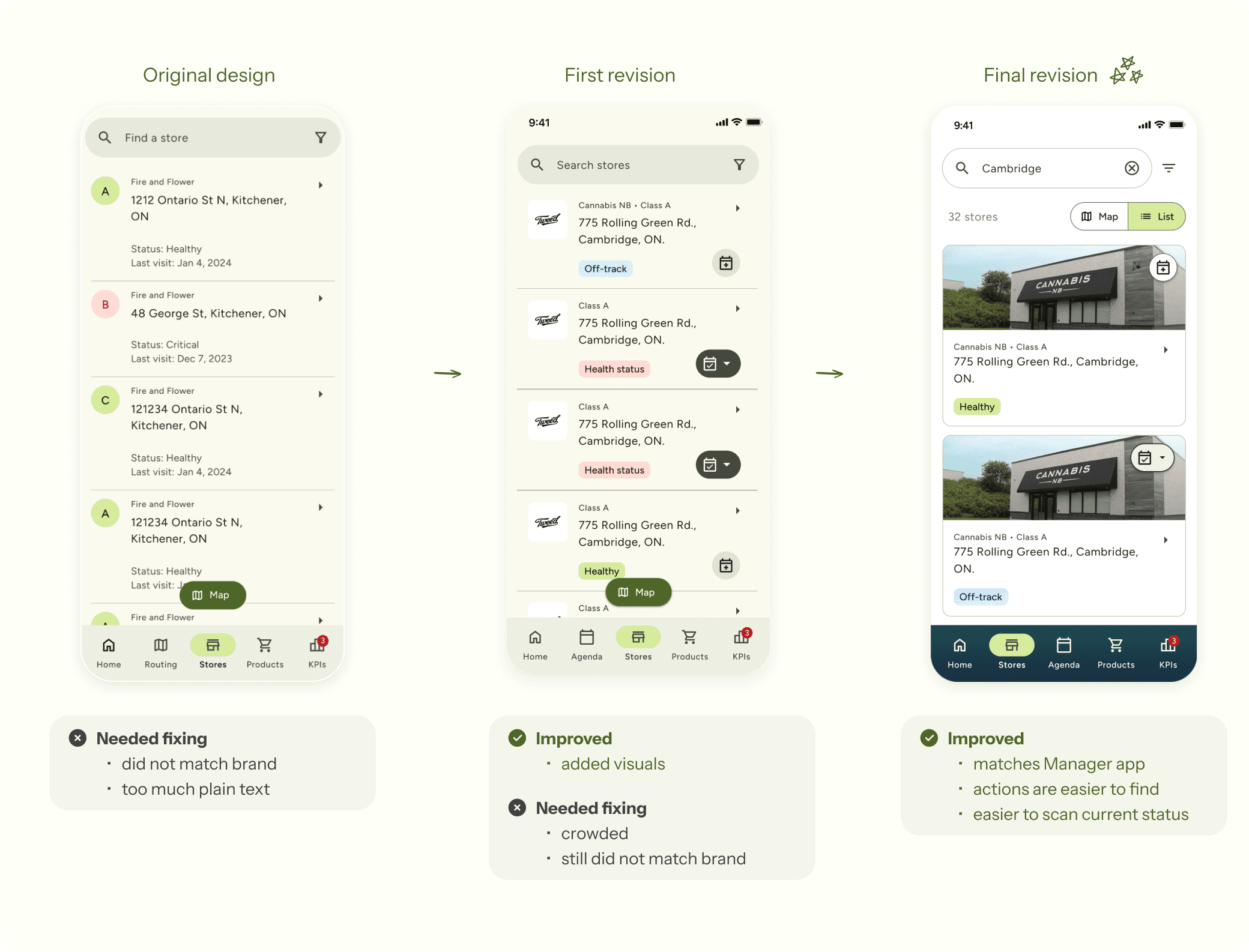
With our personalized M3 design components, I converted the entire Stores section from lo-fi to hi-fi. However, despite the speed of progress, I could tell our client did not resonate with the app designs.
Compared to the Manager’s web app (Image 2.1) the sales rep app did not feel like a part of the GreenPaths family. So, I played with new styles and he loved it. Resulted in stronger branding and user experience.

2.1 Screenshots of the Manager web app
Image
2.2 Store page iterations
Image
Visual Design system
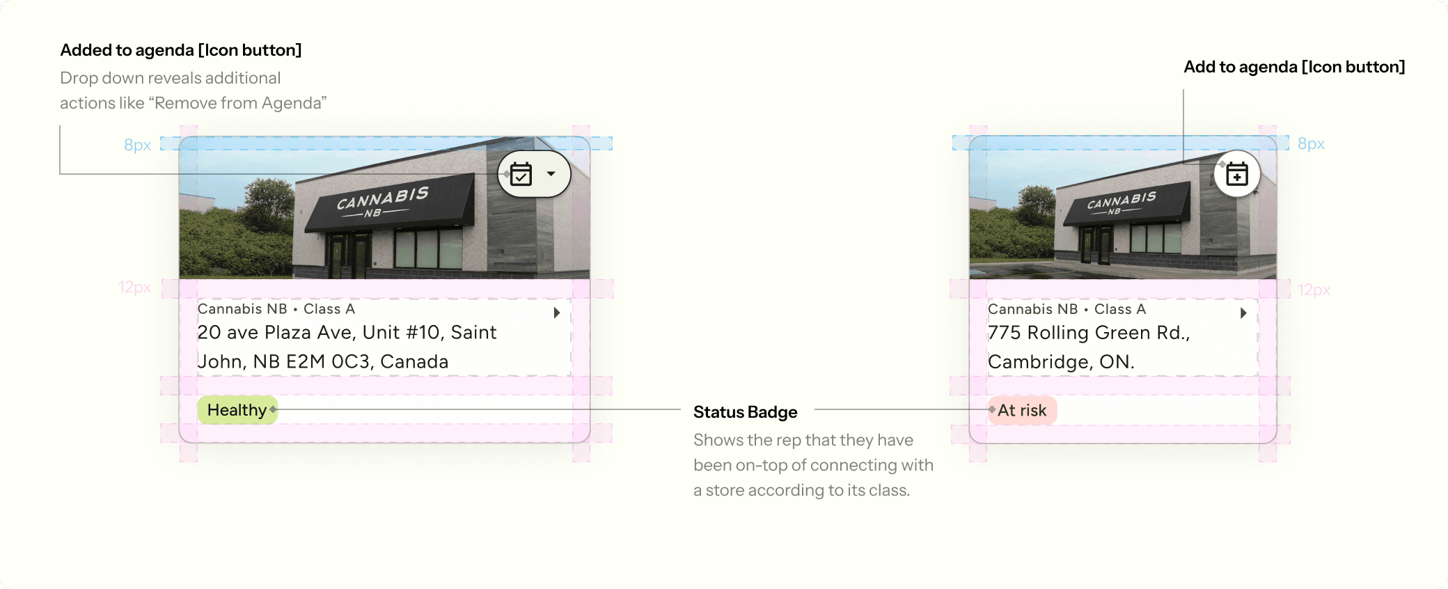
Badges & Indicators
Continuing the spirit of swift knowledge transfer.
We believed that badges were a great way to relay valuable information, such as status, when people are constantly on-the-go. I helped defined the conditions that need to be met for each status, and assigned certain colour styles.
Originally, we were going to have a different colour per status but it quickly became too vibrant and demanding for the user. We opted for the brand colours and dedicated Greens = All good, Reds = Urgent, Blues = Attention needed.

Also had to keep in mind contrast ratios. The more colours, the more difficult it was to maintain the visual language of GreenPaths and high accessibility standards for people with colourblindness.

I had to do some for the maps too. Which was quite difficult as Google Maps has various textures and colours that could cause the pins to be hard to spot. Found that a white stroke, separating the pins from the map stood out more.

Reflection
For future designers
How to build a strong rationale
If you’re starting out and are an intuitive designer like I was, you might find rationales difficult to articulate. From my experience, if you brush up on design principles, psychology, and business strategy and then practice storytelling a lot, you’ll grow a muscle for sharing your great ideas with others the way you see them.
Focus on creating a safe space
How to improve your designs exponentially? People! From conversations alone, you can gain fantastic information to consider into your product designs. Like any social setting, everyone needs to be comfortable before sharing what they know. So when starting out, its best to establish a safe space by letting people know their input is valuable and well welcomed, cause they are!!


